flex 专题
父div即flex-container:
- flex-direction: row/column/row-reverse/column-reverse。
默认main-axis是horizontal的而cross-axis是vertical的
- flex-wrap:
- flex-flow = flex-direction+flex-wrap
- justify-content: flex-start || flex-end || center || space-between || space-around (定义子div在main axis上如何排列)
- align-items: stretch/flex-start/flex-end/center (定义子div在cross-axis上如何排列 默认stretch)
ps. base-line vs flex-start
base-line会让这些文字内容坐落在水平线上
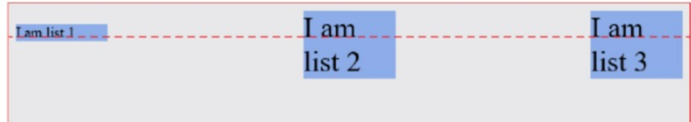
- align-content: 针对于multi-line container。哇这个好重要!也就是只要wrap状态下 设置items的竖向对齐用这个就好了 它会将子items示为一整块~
子div即flex-item
- align-self
- order:显示顺序 越低越排前 默认0
- flex-grow: 0/1+. how much a item should extend if there are extra spaces。0的意思相当于a trun-off switch 1是打开开关 数字大小代表分割比例。在该状态下 且无wrap的container中,一排列表是不会被压缩的,而是container被撑宽。
- flex-shrink: ...shrink if there are not enough spaces
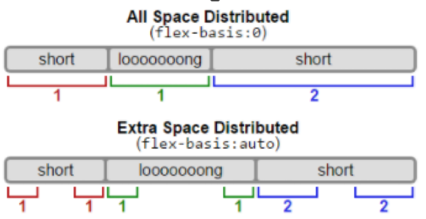
- flex-basis: 设置flex-item的初始大小 default是auto。0表示grow the item to fill the available space, and finally shrink the item whenever possible即超级弹性!。
ps. flex-basis的auto与0。在auto并grow的状态下 items的可分配宽度是除去子items内容外的宽度( relative flex items),而在0的状态下可分配宽度是所有宽度(absolute flex items)。<来源>
ps. flex-basis vs width。前者在主轴的定义下 可指width或height。行为上并无不同。前者可以加入flex简写大礼包 而在某些浏览器兼容下 用width更保险<来源>
- flex: 0 1 auto。上述简写。亦有0 0 auto。1 1 auto。'positive number' 相当于'positive number' 1 0。flex:2 也就是flex: 2 1 0.
- margin: auto。此时各方向margin会尽可能的占据掉空间。下图就是第一个item margin-right为auto的情况。

实际应用:

左侧的歌名部分和右侧的控制部分 这里左侧歌名部分就加了margin-right-auto。所以右侧控制部分就被挤到最右侧啦!当然给父container设置justify-content: space-around也是一样的效果。
不用flex的话 大概需要float+max-width来解决了把。

中间的鸟也可以用margin-left: auto margin-right:auto来解决
需要注意的是为保持间隔 给子div设置margin-left是很正常的做法
examples
部分子div固定宽度+主要div flex:1设置填充+利用order设置顺序
适用于:
-
圣杯布局的main部分 两侧side固定宽度 中间flex:1
-
两列布局:左侧nav 右侧全部
-
带icon的表单:左侧flex: 1 1 auto即可。

refs:
https://medium.freecodecamp.org/the-ultimate-guide-to-flexbox-learning-through-examples-8c90248d4676
https://medium.freecodecamp.org/understanding-flexbox-everything-you-need-to-know-b4013d4dc9af
http://output.jsbin.com/wubudog/ //这篇例子很适合做参考
待看实践篇:
https://github.com/philipwalton/solved-by-flexbox